Analytics
Asha notices that customer messages are being replied to slower than usual this week. She opens Analytics, sets the time range to 7 days, and finds the answer in under a minute — one integration's average latency jumped threefold on Tuesday. By the end of this page, you'll know how to use the same five-tab dashboard to spot trends, drill into heavy conversations, and catch integration problems before they affect your customers.
Who this is for: anyone whose role includes the analytics:read permission — team leads, admins, or anyone responsible for conversation quality and system health.
Opening the dashboard
Click Analytics under Monitor in the sidebar. The page opens on the Overview tab with the 7d time range selected by default.
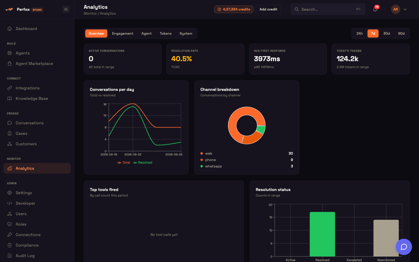
The dashboard is a tab strip with five tabs — Overview, Engagement, Agent, Tokens, System — and four lookback windows: 24h, 7d, 30d, and 90d. Both the active tab and the selected range are written to the page URL (?tab= and ?range=) so any view is bookmarkable. Share the URL and your colleague lands on exactly what you were looking at.
When you open the page or change the time range, every panel loads in parallel and independently. If one panel has no data or can't load, it shows its own empty state — the rest of the board keeps rendering. Every panel reads only your workspace's data.
Time range
The time-range pill sets the lookback applied to every panel on the page:
| Pill | Lookback floor |
|---|---|
24h | now − 1 day |
7d (default) | now − 7 days |
30d | now − 30 days |
90d | now − 90 days |
Changing the range refreshes every panel, with a small spinner next to the range pills while data loads. Time-series charts plot one point per day.
Fast at scale, never blank
Perfox keeps a fast analytics store behind the token, tool, and response-time panels so those charts stay quick even over large volumes of history. If that fast store is ever unavailable, each affected panel falls back to your primary conversation data transparently — the numbers are the same, and the board never goes blank. Conversation-shape panels (conversations over time, channel breakdown, resolution rate, identity capture, originator mix, volume by channel, delivery failures, agent-run summary and error trend, and integration health) always read directly from your live conversation data. All of this is included and managed by Perfox — nothing for you to configure.
KPI tiles
Every tab leads with four KPI tiles. Each tile shows an uppercase label, a large value, and an optional sub-label. Tiles carry a semantic accent so a metric turns colour when it needs attention:
| Accent | Colour | Example trigger |
|---|---|---|
| Success | emerald | metric is healthy |
| Warn | amber | resolution rate < 60%, tool success < 80% |
| Danger | rose | any agent error > 0, tool success below the warn floor |
Large numbers are abbreviated — 1.2k, 3.4M. The tiles give you an at-a-glance health read before you look at the charts below.
Overview tab
The Overview tab opens with four headline KPIs and four charts — a fast summary of volume, quality, and channel distribution.
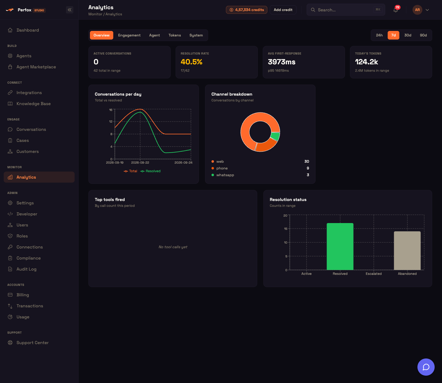
KPI tiles:
| Tile | Value | Sub-label |
|---|---|---|
| Active conversations | live count of open conversations | total conversations in range |
| Resolution rate | resolved ÷ total (green above 60%, else amber) | resolved/total |
| Avg first-response | how quickly the agent replies, in ms | p95 …ms |
| Today's tokens | today's token total | total tokens in range |
Charts:
- Conversations per day — a line chart of total vs resolved by day.
- Channel breakdown — a donut of conversations by channel with a colour-coded legend.
- Top tools fired — a horizontal bar chart of tools by call count this period.
- Resolution status — a bar chart of Active / Resolved / Escalated / Abandoned counts.
Conversations per day
The Conversations per day line chart plots two series: total conversations and resolved. Conversations are grouped by day and counted in chronological order. A widening gap between the total and resolved lines signals rising unresolved load — a good cue to check the Engagement tab for which channels or originators are driving the volume.
Channel breakdown
The Channel breakdown donut shows how conversations split across channels. Each conversation is counted against the channel it started on, sorted by volume, with each slice colour-keyed:
| Channel | Colour |
|---|---|
| Web | orange |
| green | |
| SMS | blue |
| purple | |
| Voice | amber |
| Phone | dark orange |
| Mobile | teal |
| Unknown | grey |
This is a point-in-time split across the selected window. To see how each channel's volume rises and falls over time, switch to the Engagement tab's Volume by channel chart.
Resolution rate and status
The Resolution rate KPI and Resolution status bar chart both come from grouping your conversations by status. The KPI shows the percentage — green above 60%, amber below — with a resolved/total sub-label. The bar chart renders Active, Resolved, Escalated, and Abandoned counts side by side (Active = orange, Resolved = green, Escalated = amber, Abandoned = grey). The Engagement tab reuses the same data for its Active and Escalated KPIs.
Response time
The Avg first-response KPI reports how quickly the AI agent dispatches its first reply. It shows the average with a p95 …ms sub-label. Because p95 is surfaced alongside the average, tail-latency spikes that the average would hide become visible.
Engagement tab
The Engagement tab focuses on who is talking and through which channels.
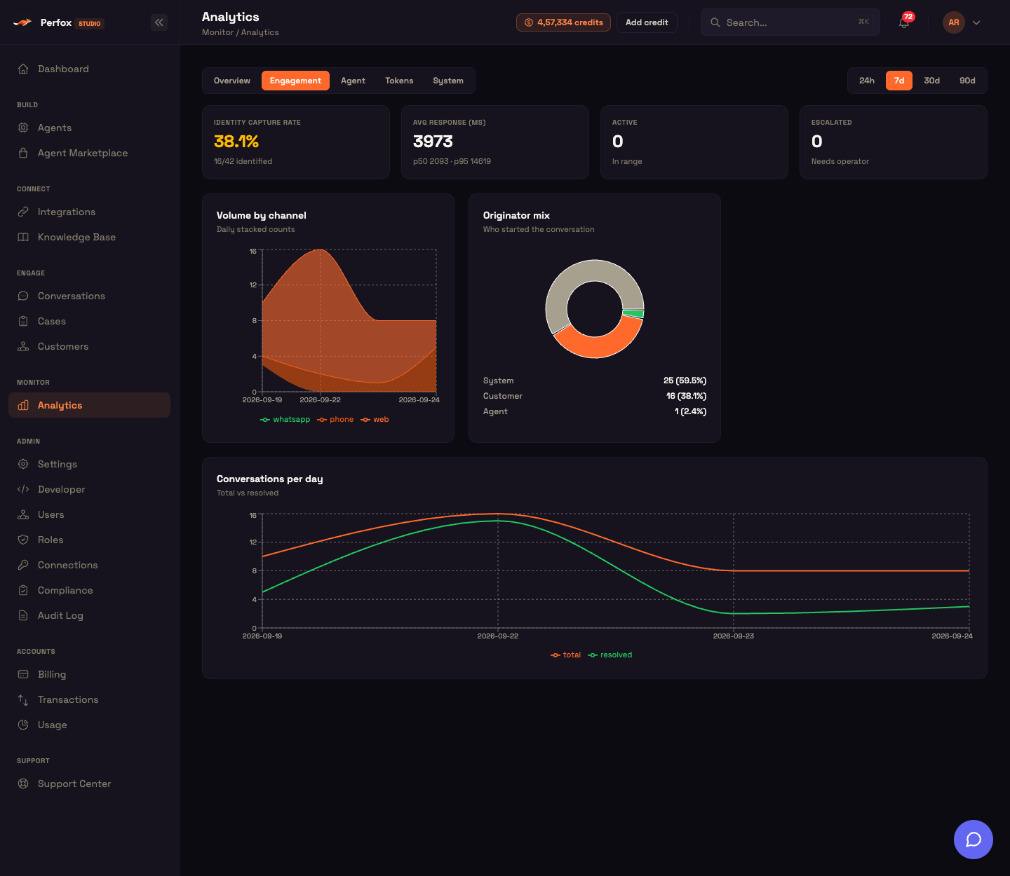
KPI tiles:
| Tile | Value | Notes |
|---|---|---|
| Identity capture rate | identified ÷ total | green above 50%, sub identified/total identified |
| Avg response (ms) | agent reply latency | sub p50 … · p95 … |
| Active | open conversations in range | — |
| Escalated | escalated conversations | amber when > 0 ("needs operator") |
Charts:
- Volume by channel — a daily stacked-area chart with one coloured band per channel.
- Originator mix — a donut of who started each conversation (customer / agent / system) with a percentage legend.
- Conversations per day — the total-vs-resolved line chart, repeated here for engagement context.
Identity capture rate
The Identity capture rate KPI measures the share of conversations where the agent captured at least one contact identifier — a non-empty phone, email, or external ID. It returns total, identified, anonymous, and the capture rate (identified ÷ total × 100). The tile is green above 50% and amber below. A low rate means most conversations stay anonymous, with no lead or contact captured for follow-up.
Volume by channel
The Volume by channel stacked area chart plots daily conversation counts with one band per channel. Conversations are grouped by day and by starting channel (unknown-channel conversations are bucketed as unknown), then pivoted into per-day rows. Unlike the Overview donut — which shows a single split across the whole window — this chart shows how each channel's volume rises and falls day by day.
Originator mix
The Originator mix donut shows who started each conversation. Perfox looks at the first event in each conversation's timeline and classifies the initiator:
| First actor | Originator class |
|---|---|
| The end-user | customer |
| The AI or a human agent | agent |
| Anything else | system |
Each class gets a raw count and a percentage of total. This distinguishes inbound (customer-started) from outbound or proactive (agent-started) engagement — useful when you run scheduled outreach and want to separate it from organic inbound volume.
Agent tab
The Agent tab audits how well the AI agent's tools and models are performing.
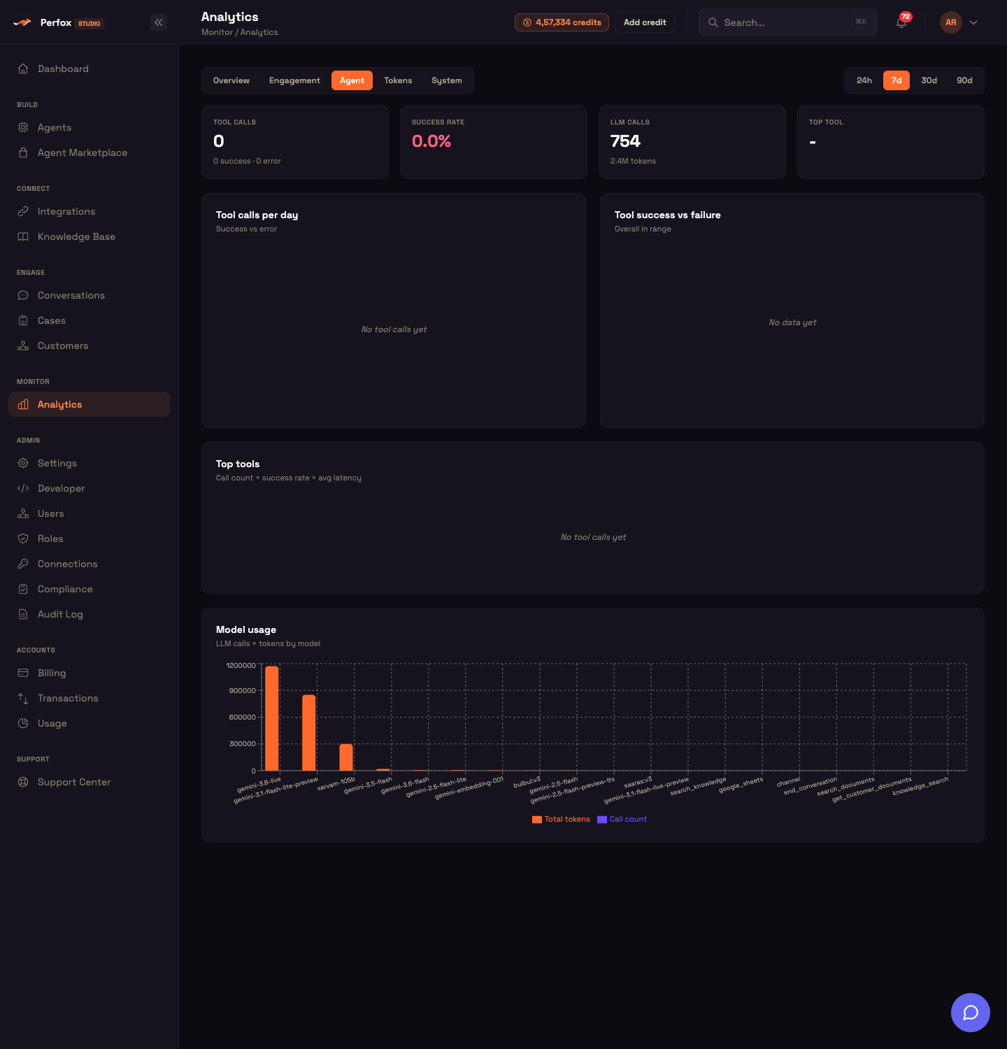
KPI tiles:
| Tile | Value | Notes |
|---|---|---|
| Tool calls | total | sub N success · M error |
| Success rate | success ÷ total | green > 95%, amber > 80%, else rose |
| LLM calls | count | token sub-label |
| Top tool | highest-volume tool name | + its call count |
Panels:
- Tool calls per day — a stacked bar of success (green) vs error (red) per day.
- Tool success vs failure — a donut plus a success/error count block.
- Top tools — a full leaderboard table (Tool · Calls · Success · Errors · Success % · Avg latency), success % colour-graded.
- Model usage — a grouped bar chart of total tokens and call count per model.
Tool success rate
The Success rate KPI and Tool success vs failure donut report the aggregate pass rate across all tool calls. Every call the agent made in the window is grouped by outcome, returning success, error, total, and a success rate (success ÷ total × 100). The donut splits green (success) vs red (error), and the KPI colour-codes the rate (green > 95%, amber > 80%, rose below). This is the single headline for agent tool reliability.
Top tools leaderboard
The Top tools leaderboard ranks every tool your agent used — both connected integrations and built-in tools — by usage. For each tool it shows call count, success count, error count, success rate (%), and average latency. Results are sorted by call count, top 10 shown. Each row's success % is colour-graded (green > 95%, amber > 80%, rose below), with average latency in ms.
Worked example — catching a flaky integration:
Setup: Acme Diagnostics' agent uses a get_report_status tool to look up lab results. The tool success rate in this week's Overview looks fine at 91%, but Asha wants to investigate.
Action: She opens the Agent tab and scrolls to the Top tools leaderboard. get_report_status appears in row 2 with 340 calls, 309 successes, 31 errors, and an average latency of 1,840 ms.
Result: The leaderboard row is amber (success rate between 80% and 95%), and the latency is notably higher than the other tools. Asha switches to the Tool calls per day chart and sees the error segment grew on Thursday.
What just happened: The leaderboard surfaced the specific tool causing drag before any customer escalation reached the team. Asha can now open the Conversations workspace, filter to that day, and find the affected conversations — turning a dashboard observation into a targeted fix.
Tool latency
Per-tool latency ranks each tool by its average response time, slowest first, alongside its call count. This feeds the Avg latency column of the Top-tools leaderboard. A single slow tool that's otherwise reliable (high success rate, high latency) is easy to isolate here.
Tool calls per day
The Tool calls per day stacked bar chart plots daily tool-call volume split into success (green) and error (red) segments. A growing red segment day over day exposes a regression in tool reliability that the aggregate rate can mask.
Model usage
The Model usage grouped bar chart and the LLM calls KPI draw from your usage totals for the window. The chart plots total tokens and call count per model side by side, so you can see which models consume most of your token budget. Speech models (for example bulbul:v3, saaras:v3) appear alongside language models, and some usage is recorded under the name of the tool that triggered it (for example search_knowledge), so not every bar is a model name.
Tokens tab
The Tokens tab is the token-consumption view. It reports token counts and never money (see Tokens, not cost below).
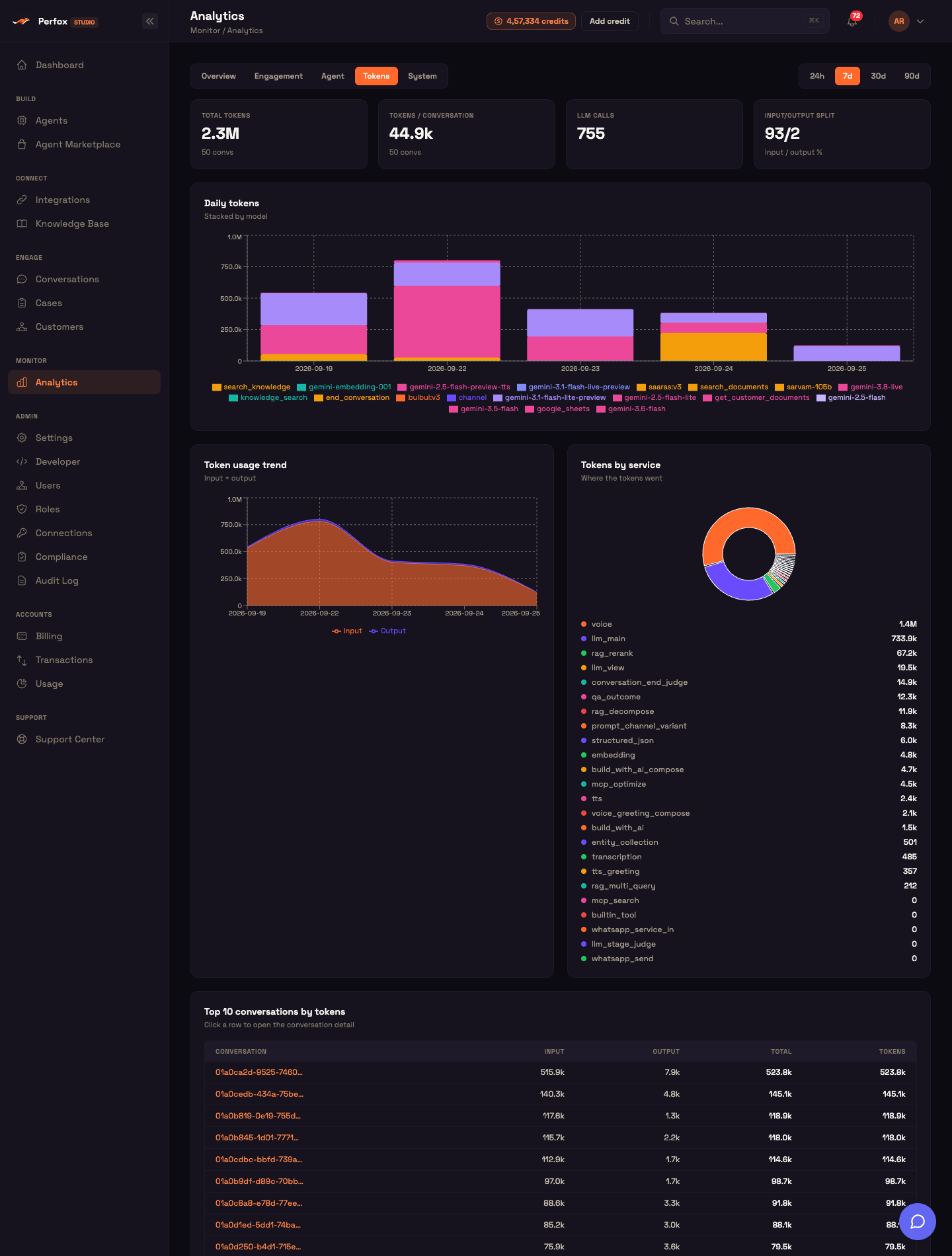
KPI tiles:
| Tile | Value |
|---|---|
| Total tokens | total tokens in range |
| Tokens / conversation | average per conversation |
| LLM calls | LLM call count |
| Input/output split | input% / output% |
Panels:
- Daily tokens — a bar chart stacked by model per day.
- Token usage trend — a stacked area of input vs output tokens.
- Tokens by service — a donut of where tokens went (conversational agent / media processing / and more) with a legend.
- Top 10 conversations by tokens — a drill-down table (Conversation · Input · Output · Total · Tokens) where clicking a row opens that conversation in the Conversations workspace. The Total and Tokens columns currently show the same number.
Daily tokens
The Daily tokens bar chart plots per-day token totals stacked by model. Usage is grouped by day and model (unlabelled entries are bucketed as unknown), input and output tokens are summed, and the result is pivoted into per-day rows with a per-day total. Each stack segment is colour-keyed by model. The Overview tab's Today's tokens KPI reads the current day's total from this same data.
Token usage trend
The Token usage trend stacked area chart plots daily input tokens vs output tokens. Usage is grouped by day and summed into input tokens, output tokens, a computed total, and call count, in chronological order. The input-vs-output split reveals whether prompt size or long AI responses are driving consumption.
Tokens by service
The Tokens by service donut attributes token consumption to the part of Perfox that spent it. The legend lists each service by its short name — for example voice (voice calls), llm_main (the agent's text replies), rag_rerank / rag_decompose (knowledge-base search), embedding (knowledge-base indexing), tts / transcription (speech), and build_with_ai (Build with AI) — with its total tokens, sorted by volume. This separates conversational LLM spend from background knowledge-base and media work, so you know whether your token budget is going to customer conversations or to background processing.
Top conversations by tokens
The Top 10 conversations by tokens table lists the most token-heavy conversations in the window. Usage rows are grouped by conversation, input and output tokens are summed, sorted by total, and the top 10 are shown. Each row shows a shortened conversation ID with its Input / Output / Total tokens, and clicking any row opens that conversation in the Conversations workspace — turning the analytics view into a direct drill-down to the exact heavy conversations.
Tokens, not cost
Your Analytics dashboard surfaces token counts — input tokens, output tokens, total tokens, and call counts — and never any provider currency cost. Every value on the Tokens tab is a token number, not money. The per-conversation average separates total tokens in range (including non-conversational knowledge-base and media work) from conversation-attributable tokens, so the average matches the conversation count.
System tab
The System tab is the operational-health view — integrations, agent run outcomes, and delivery success by channel.
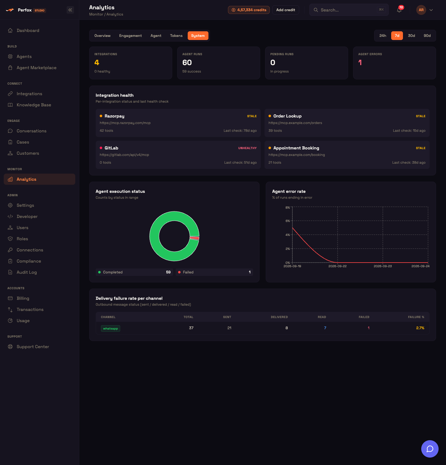
KPI tiles:
| Tile | Value | Notes |
|---|---|---|
| Integrations | connected integrations | sub N healthy, green when all healthy |
| Agent runs | total agent runs | sub N success |
| Pending runs | paused / in-progress runs | — |
| Agent errors | errored runs | danger when > 0 |
Panels:
- Integration health — a card grid, one card per connected integration with a status dot, name, URL, tool count, and "last check" age.
- Agent execution status — a donut of agent runs by status with a coloured legend.
- Agent error rate — a line chart of error % over time.
- Delivery failure rate per channel — a table (Channel · Total · Sent · Delivered · Read · Failed · Failure %) colour-graded by failure rate.
Integration health
The Integration health card grid shows one card per connected integration. Each card has a coloured status dot, the integration name, URL, tool count, and last-health-check age.
Key rule: if the last health check is older than 5 minutes and the integration still reports itself as healthy, its effective status is downgraded to stale (amber). A healthy-but-not-recently-checked integration is flagged rather than trusted:
| Effective status | Dot colour |
|---|---|
| Healthy | emerald |
| Stale | amber |
| Unhealthy / error | rose |
| Unknown | grey |
The Integrations KPI at the top of the tab counts only the healthy ones.
Agent execution status
The Agent execution status donut and the Agent runs / Pending runs / Agent errors KPIs come from grouping your agent runs by status and rolling them up into four buckets:
| Rolled-up bucket | Raw statuses |
|---|---|
| Active | running |
| Paused | paused |
| Success | success + completed |
| Error | error + failed |
The donut itself shows each raw run status (for example Completed and Failed) with a legend of status → count, coloured green for successful statuses, rose for failed ones, amber for paused and orange for running.
Agent error rate
The Agent error rate line chart plots the percentage of agent runs ending in error, day by day. Runs are grouped by day into total, errors (error or failed), and an error rate (errors ÷ total × 100). A rising error-rate line is the earliest signal that an agent — or an integration it depends on — is degrading.
Delivery failure rate per channel
The Delivery failure rate per channel table tracks outbound message delivery health. Perfox reads the delivery receipts on your conversation timeline, groups them by channel and delivery state, and tallies sent / delivered / read / failed / total per channel plus a failure rate (failed ÷ total × 100), sorted by volume. The failure % is colour-graded:
| Failure rate | Colour |
|---|---|
| > 10% | rose |
| > 1% | amber |
| else | emerald |
This surfaces a channel whose sends succeed at the provider's API but fail downstream — for example a Plivo error 900 (insufficient credits) showing up as a failed WhatsApp delivery.
Feature reference
Tabs
| Tab | Purpose | What it covers |
|---|---|---|
| Overview | Headline conversation KPIs + charts | Active conversations, resolution rate, response time, conversations over time, channel breakdown, top tools, token totals |
| Engagement | Who is talking, through which channels | Identity capture, response time, resolution, volume by channel, originator mix, conversations over time |
| Agent | Tool-call health, leaderboard, model usage | Tool success rate, tool calls per day, top tools, model usage |
| Tokens | Token consumption trends + drill-down | Tokens per conversation, model usage, daily tokens, usage trend, tokens by service, top conversations by tokens |
| System | Integration and run health, delivery failures | Integration health, agent-run summary, agent error trend, delivery failure rate |
Time ranges
| Pill | Lookback | Default |
|---|---|---|
24h | now − 1 day | |
7d | now − 7 days | ✅ default |
30d | now − 30 days | |
90d | now − 90 days |
List limits and defaults
| List | Rows shown |
|---|---|
| Top tools leaderboard | 10 |
| Top conversations by tokens | 10 |
Behavioural notes
- URL persistence —
?tab=and?range=make any view shareable and reload-safe. - Parallel fan-out — every panel loads independently; one failing panel never blanks the board.
- Access — the Monitor section and this page need the
analytics:readpermission. - Fast at scale — token, tool, and response-time panels are served from a fast analytics store with a transparent fallback to your live conversation data; conversation-shape panels always read live. Included and managed by Perfox — nothing to configure.
- Drill-through — clicking a Top conversations by tokens row opens that conversation in the Conversations workspace.
See also
You can now read any five-tab view across your workspace — spotting volume trends, catching flaky tools, tracing heavy conversations, and monitoring integration health in one place.
- Dashboard — start here for a concise headline summary before diving into tab-level detail.
- Conversations — the operator workspace that the Top-conversations drill-down links into; open directly from any token-table row.
- Cases — view conversations grouped by AI status and ticket status; useful alongside the resolution-rate and escalation data in Analytics.
- Audit Log — the workspace change trail; pair it with the System tab when you need to correlate a configuration change with a spike in agent errors.